Making sense of LGDE data
Why Demo Dashboards?
Our motto is "Visualize. Explore. Compare. Understand." How do dashboards enable this?
- Visual: Unlike tables full of numbers, the graphics in a dashboard invoke the pattern-processing capacity of your brain. You see more.
- Interactive: Unlike a piece of paper (or PDF), a dashboard is interactive—it allows you to explore without flipping through hundreds of pages. You can drill-down to the details with a few mouse clicks. Start with the big picture and stop clicking when you have answered your question.
- Multidimensional: You can make comparisons between services, over time, even across a peer group of municipalities
Put these three together and you have a tool for understanding.
Try it for Your Community
We have created demo dashboards using public data to show you how this can work.
Operation of the Dashboard
These dashboards support two activities:
 |
Explore allows you to see where the money in your organization comes from and where it goes. The purpose of Explore mode is allow you to compare different categories of revenues and expenses both to each other and over time. All Explore graphs are in total dollars. Compare allows you to benchmark against a group of peer communities. The measure in the Compare graphs is dollars per capita. You can compare your organization's revenues and costs per capita to the lower decile, median, and upper decile in your peer group. |
 |
The second toggle allows you to switch between Revenue and Expenses. Both revenues and expenses are segmented into broad categories. For example, revenues are segmented into "Taxpayer Funded" sources (taxes and fees) and "Other Sources" (grants, and so on). Expenses are segmented by broad category of services. |
The basic flow of each dashboard is from general to specific. For example, the top-left pie chart in the image below shows an organization's expenses split into broad segments, such as "Infrastructure" and "Non cash" (e.g., depreciation charges to reflect the loss in value of capital assets). The sorted bar chart to its right shows the services within the segment. The bar chart at the bottom shows the trend in expenses over time. This general-to-specific layout allows you to start with the big picture and, with a few mouse clicks, drill down on expenses or relationships that interest you.

Some Background
The demo is not the full-featured Benchcube dashboard. What is the difference?
The Province of British Columbia, like many provincial and state governments, collects summary statistics from municipalities (see LGDE data site). This is a great idea; however, it has three shortcomings in practice:
- Data collection is largely manual (see requirements) This means the data collection is onerous for the local government and is, as a result, a couple of years behind. As of August 2017, the most recent data available on the LGD website is 2015 (update: we are updating this as data becomes available).
- The format is stored as spreadsheets, one for each combination of year x organization. Although it is possible in principle to put this information together into compelling visualizations, I have yet to see it done (although CivicInfo tells me they are working on a broader set of dashboarding tools).
- The data is coarse-grained. The granularity of the LGD data is the same as a Segmented Statement of Operations, which municipalities include in their audited financial statements. The data provides enough granularity to suggest strengths, weaknesses, opportunities, and threats, but not enough detail to resolve the really important questions.
How are Peer Groups of Communities Determined?
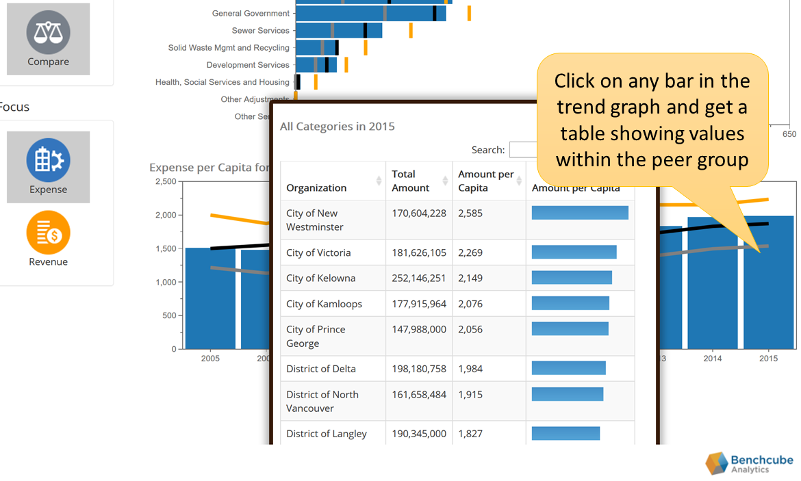
The notion of a "peer group" is central to benchmarking. If you are in Compare mode and click on a bar in the trend graph, you will get a table showing total and per-capita values for each organization in the peer group:
The natural question is: where do these peer groups come from? We kept it simple (by which I mean "automated") for the demo dashboards: we conducted a k-means cluster analysis in the two dimensional space created by community size and population. The clusters can be shown in Tableau using different colored dots (only some dots are labeled to improve readability). For example, the yellow dots on the right (Abbotsford, Delta, Prince George) are clustered together by the algorithm into a peer group.

Note that both axes (land area and population) are shown on a log scale. The province's two largest two cities, Vancouver and Surrey, form their own cluster on the far right of the chart. But the clusters in the middle of the pack contain many more communities.
I say this is a "simple" approach because it is algorithmic clustering based on only two factors: land area and population (with population being the more important determinant). It ignores other factors that can impact the cost of service provision, such as location in the province, ownership of particular assets (such as an electrical utility), regionalization of services, and so on. For real (non-demo) peer groups, we are more likely to ask communities who they think their peers are. Cluster analysis merely provides a first approximation.