Report card for Alberta municipalities
The platform for the United Conservative Party in Alberta's recent provincial election included the following::
Improve local government financial reporting by preparing an annual Alberta Municipalities Measurement Index so Albertans can evaluate the performance of their local government in comparison with others on such key fiscal indicators as the property tax burden, revenues, spending, and debt.
Although the UCP and its leader, Jason Kenney, were ultimately successful in the election, several commentators panned the proposal. Calgary Mayor Naheed Nenshi dismissed the proposal as "a report card" (with all its normative implications). Others pointed out that Alberta already publishes a good amount of data on its Municipal Affairs site.
Yes and no. My view is that the data on the Municipal Affairs site is a an intermediate product. It is certainly valuable information, but not quite ready for consumption in its current form. Who is going to go through more than 200 spreadsheets in order to see how local governments in Alberta are raising and spending money? A report card, on the other hand, is the wrong metaphor. A report card is a static, high-level, evaluation. What is needed is a dynamic tool that can allow both local governments and the governed to better understand their financial situation and make realistic comparisons to similar communities.
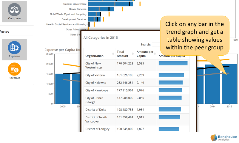
We created financial dashboards for British Columbia local governments using that province's equally user-unfriendly cache of financial summary data. I have just added Alberta local governments to the data warehouse, so now people in both British Columbia and Alberta can (a) visually explore revenues and expenses for their favorite local government and (b) compare these revenues and expenses to a peer group of similar organizations.
The purpose of this demonstration tool is to illustrate the power of visual interactive benchmarking. Most people, including many managers and elected officials, have enourmous difficulty interpretting conventional presentations of financial information (budgets, financial statements, and, yes, report cards). The idea with a visual interactive dashboard is that you start with the big-picture (literally) and click on things that catch your eye. Each click triggers filters and drill-downs to a more detailed level.
Take a look and let me know what you think. I have done a quick sanity check of the data, but the tool and the underlying data is offered as is (in other words, check the numbers before you use them to pick a fight). Contact us if you want to talk about detailed (i.e., GL account-level ) drill down and visual analytics.
Some methodological background and caveats
- A brief users guide for the dashboards can be found here. The guide was written for the BC context, but the tool works the same regardless.
- The raw data comes from the spreadsheets posted on the Province of Alberta's Municipal Affairs site. In my discussions with CFOs in British Columbia, preparing the annual information returns to support the province's site is an onerous task. I assume it is similar in Alberta. The data typically lags due to this workload and the requirement to submit final actuals. As of mid-2019, the site only includes information up to 2017.
- BC and Alberta use different categories and are thus not directly comparable. Indeed, the Alberta data is much richer and is more granular. Of course, fine granularity can be problematic when doing comparisons because different municipalities undoutedly map revenues and expenses to these categories in different ways.
- Neither the Alberta nor the BC data support a Service x Activity breakdown (e.g., how much did the City of Calgary spend on Fire Service wages verus Fire Service capital?). For this, you need the full Benchcube tool.
- The Compare tab uses per capita taxation to compare revenues and expenses across different local governments. Of course, this is not a meaningful real-world measure: taxes are collected on various class of properties (residential, industrial, commercial), not individuals. But per capita taxation is a reasonably fair basis for high-level comparisons. The full Benchcube tool allocates revenues and expenses to specific properties, and thus provides a more realistic measure of impacts.
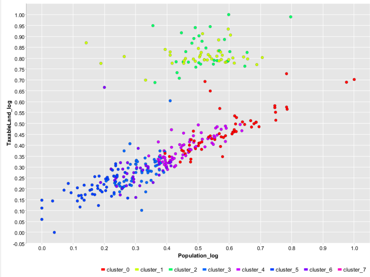
- The peer groups for the Compare tab were created using k-means clustering based on four variables: the muicipality type (City, Town, Summer Village, etc.), population, latitude, and amount of taxable land in hectares. A more formal regression analysis suggests that population, latitude, and physical extent drive overall taxes. It is diffficult to visualize clusters in a 4-dimensional space, but we can see the basic idea using a 2-dimensional representation (here population and taxable area—both on a log scale to improve readability). Each dot is a community in Alberta and the colors indicate the cluster assigned by the k-means algorithm.
- If you do not like the peer groups created by this simple (and fully automated) clustering approach, you can click on the appropriate bar in the trend graph on the Compare page and export data to Excel (there is an "Export" button). You can then pick and choose your own comparables.